Most likely from the first glance at the page, you will appreciate the website design of the main page. If there is a static picture, then bad news. She’s boring in today’s world. The attention of customers needs to be attracted in different ways. Great slider option.
In the article you will find tips for creating the best slider.
Try To Use Full-Screen Photos
On this slide, depict the current promotion or the product that was most searched for on social networks. So the person will feel that he has come to the address.
Choose The Right Photos:
First and foremost, you need to choose the right images that have enough white space. Make sure that your website has excellent quality of photos. Check out these free photo stocks:
Pay Attention To The Page Loading Speed
Slider images can slow down your website. Let’s figure out how to prevent extra seconds of loading and not let the client get bored.
- Optimize the images before using them on your website banner
- Use the right tools to reduce the size of the images without compromising on the quality of photos
- Talk to the best website designers to help you optimize the images used on the banners.
Have A Clear Purpose
“Buy multiple items from us and get a discount” or “Hurry up to buy two pillows before April 30 and get a warm blanket as a gift”?
In the first sentence, a general phrase without a specific phrase sounds. What items do you need to buy? What’s the discount? How long does the promotion last?
In the second, everything is very clear.
On your slider, clearly describe the offer to the client. A person does not like to look for the conditions of a promotion or other offer for a long time. Most likely, he will simply go to another website.

Use A Carousel
Carousel designs are widely used for galleries, timelines, key features, promotions, news, and more. Carousel designs help users save a lot of clicks and time.
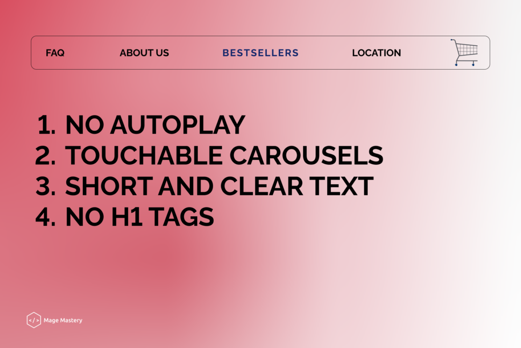
5 Great tips for carousel website design
- No autoplay
- Keep the text short and clear
- Avoid duplicating H1 tags
- Make carousels touch-friendly

Responsiveness
While designing a carousel banner slider, you need to make sure that it is responsive. Your audience may be browsing your website on mobile devices and tablets. Hence, it is important to make sure that the images used on the carousel look as interesting as they appear on the desktop.
Conclusion
The purpose of the website is to simplify the path to purchase and complete the deal in minutes. What can we as developers do?
1. Minimize page load
2. Correctly format the text for the slider
3. Use highquality photos
Use the slider on your website and share your impressions with us in the comments below!
